Hahhaha-ghost. that's a ghost. ghosts aren't very scary ahough, but i swear to god i had some sleep paralysis. i thought i saw a ghost just a white ghost... holy fuck... i've actually seen that.. it really happened to me... whoa shit!
That's pretty scary dude. Like that I've actually encountered a ghost, but as you grow up you don't know if it was just your innocence, naivety, or extreme creativity.
If I saw a ghost, actually scratch that, I experienced it, and has been retained in my memory as a mystery. Fuck that !
What was he doing. I bet he was going to tell me some rhetoric.
If I could only go to the pas..... actually I have to stop my self right there. reminiscences are of the past.. and only are allowed for five seconds.
So much present like, right now. So many like what are we suppose to do with that much?
"Hey whats up with the anti-christ?"
The future can be great, and will always to be great. the mind has to know everything can be great, so start training. I have to start training my self.
Motivation is so important. But it can be overridden by self-discipline. If you have enough self disclipline, even if you aren’t motivated then you can still get things done. As you get things done you can start relying on stuff to fall your way. You can start to understand that time is going to get better and you’re going to be healing any physical or mental woes. Yep, so sometimes you should just do it. sike
Friday, April 13, 2007
Wednesday, April 11, 2007
Sunday, April 8, 2007
Post 14
 This is a parody of a Calvin Klein ad using all three of ethos, pathos, and logos. There is a large amount of exaggeration.
The ethos parody is that it has the authority of the "Calvin Klein" ad going for it. So this parody signafies that it has a large amount of importance.
It is just doing the exact opposite of the ad of Calvin Klein. In the regular ads, it shows a very alluring man that defines masculine beauty. This is totally opposite of that ad. This is kind of a repulsive man whom got some really hairy genes. The kind of disgusted experiance that you get from this is the pathos appeal.
The lothos is the logic in the parody it self. The text say's Reality then shows a picture of a hairy men. Kind of a back hand of saying to Calvin Klein to get real, if you put on this cologne you won't turn in to a hunk.
One of their arguements is exaggeration though. If they are talking about "reality," then I don't really believe that a decent amount of the population is as hairy as that men. It's just probobly the same percentage as very handsom men. (1% really hairy people, 1% really handsom people) As a parody, it totally took it to the extreme under the pretense of showing you something in the average. But that is what it is suppose to do, and in my opinion it did a good job of doing so.
Post 12

The picture intended to appeal to my sexually, and it has. What attracted me to this ad sexually? The figure of her body is amazing and draws me in instantly. It has a very waif look that compels me to look up and down at the picture many times.
Her face is an important aspect to notice as well in terms of sexual appeal. We are unable to see her eyes at all. The large bangs cover that up completely. A mysterious air is about her because of that. I can tell she has high cheek bones which is very attractive though, and her mouth has a pleasant shape. Her hand is placed near her mouth which can't help me but wonder what kind of person she is. Is she innocent, timid, or knows that gesture turns men on?
One last thing about the sex appeal is that her hand is through her shirt. This does make it hard to judge her chest, but in a way makes me intrigued even more. This ad plain out is appealing to my dream girl. It definitely got me, bad. (Also definitely appropriate, even for children.)
There was no extreme exaggeration of pathos in this ad. No slippery slope, no scare tactic, or anything. Just plain out a very attractive woman with a designer name. Although, there is a little ambiguousness though. If you buy an Calvin Klein apparel, you may or may not perhaps be stunningly beautiful. I'm guessing this woman would be in the top 98% percentile of attractiveness. (In my eyes)
This is a tough call indeed. When I see the ad I just see a beautiful woman, I could care less about the designer. But the ad is all about the designer, so who is it appealing to? I'm guessing women would be more impacted by this ad of an attractive lady. This is pathos for them, and it is indeed exaggerating. Not all woman are that beautiful, and buying a brand certainly won't make you more beautiful. Going for insecure women maybe..
In my opinion this ad is unfair for the majority of the woman who read it, as it an unreal view of most woman. So it does exaggerate pathos in that respect.
Sunday, April 1, 2007
post 11
There is no color at all. There seems to be one alignment that is dominant. The one in the middle right, which is just mostly a blob seems aligned just off center to subtract the other potential focus object. The other alignment is more near the top left of the picture. Together you can't really focus on both at the same time.
Immediately your eyes are looking for patterns. You try and make sense of webs but it seems like it is tilting. If you look at some of the main features it seems to change a little bit in your perception each time you look.
The size isn't a desktop wallpaper size thank goodness. It's just a nice modest small size. The picture is able to get in to your eyes fully at first glance.
The choice of material isn't clear at all. To this point of examining all of this, I'm not sure if it is paint, digitally rendered stuff, or what. Very absorbing topic to fall in to while gazing at the photograph.
Mysterious is one word that I would describe the overall mechanics of this paper. There is just a limited range of actual material that you can see which is placed in such a way that strains the neurons in my mind. I can't seem to grasp anything about it coherently. I believe that this is an emotional attachment because of the visual aspect of it. There is only a message that formed in the picture that came in the form of confusion that reached me.
Immediately your eyes are looking for patterns. You try and make sense of webs but it seems like it is tilting. If you look at some of the main features it seems to change a little bit in your perception each time you look.
The size isn't a desktop wallpaper size thank goodness. It's just a nice modest small size. The picture is able to get in to your eyes fully at first glance.
The choice of material isn't clear at all. To this point of examining all of this, I'm not sure if it is paint, digitally rendered stuff, or what. Very absorbing topic to fall in to while gazing at the photograph.

Mysterious is one word that I would describe the overall mechanics of this paper. There is just a limited range of actual material that you can see which is placed in such a way that strains the neurons in my mind. I can't seem to grasp anything about it coherently. I believe that this is an emotional attachment because of the visual aspect of it. There is only a message that formed in the picture that came in the form of confusion that reached me.
post 10
There were a few photos before I picked this one that seemed just as good candidates. But this photo had the advantage of being last seen, and I was too lazy to click back. This was really good.
I saw that there was no color at first. Thats what made me stay there for the first minute. I was glaring at it, first at the no color scheme, then at the shapes.
Then my mind was wondering that the picture began beating to the bass of the song. I looked back at the song and it was bouncing. I liked what it got. It got a nice pace up and down. I turned it down and started really reflecting on it.
There was this pause between the beating and the non-beating. This photo makes you reflect, but only reflect on how you're trying so hard to reflect at that same time. Thats the only thing you can think about, is reflecting over the actual reflecting process.
This photo is just eluding to my conscious, so it can only run loops. But a quick reality frame snap and I'm right back to the same beat.
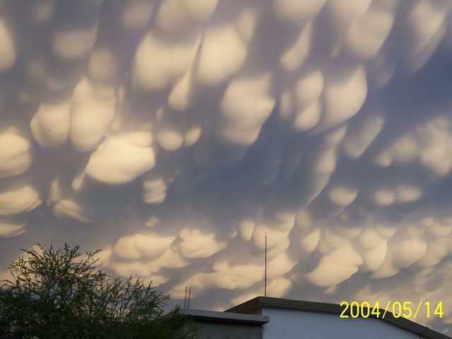
Clouds in the sky is analogous to this picture. There was a memory of my childhood when I was taken back to the point where my teacher handed out marshmellows. We just ate them and looked at the sky. Since that time I just stare at the clouds and see what I've got up there. Different perspective of objects go and in my mind.
I saw that there was no color at first. Thats what made me stay there for the first minute. I was glaring at it, first at the no color scheme, then at the shapes.
Then my mind was wondering that the picture began beating to the bass of the song. I looked back at the song and it was bouncing. I liked what it got. It got a nice pace up and down. I turned it down and started really reflecting on it.
There was this pause between the beating and the non-beating. This photo makes you reflect, but only reflect on how you're trying so hard to reflect at that same time. Thats the only thing you can think about, is reflecting over the actual reflecting process.
This photo is just eluding to my conscious, so it can only run loops. But a quick reality frame snap and I'm right back to the same beat.
Clouds in the sky is analogous to this picture. There was a memory of my childhood when I was taken back to the point where my teacher handed out marshmellows. We just ate them and looked at the sky. Since that time I just stare at the clouds and see what I've got up there. Different perspective of objects go and in my mind.
Post 9

There is a snow white background. Everything varies from gray to white to dark. A large fraction of the darkness is situated in the quadrant middle-right box. A normal thirty second gaze would yield nothing. The object drags in to a center of focus.
A little below the top left is a small piece of darkness as well. A larger dark near the right center of the object in the corner is more predominant.
There is no real hint of the rainbow in this piece. Only shades are located on this canvas. (The rest of the pieces in the gallery under the artist do not have color as well.)
There seems to be a little more shade around in the third and fourth quadrants than the first and second quadrants. It some places it seems like the white seeps out to the other white that border it in general. There is a melt on to the page.
The type of technique that was put on to this piece is unknown. There is a very simple answer, but was just not found on the page displaying the gallery.
Subscribe to:
Comments (Atom)